
Usability testing informs better decision-making.
Once you’ve created your surveys and completed a prototype, it’s time to start usability testing. As a designer and project manager, I’ve had experience organizing and implementing usability testing in both formal and informal settings.
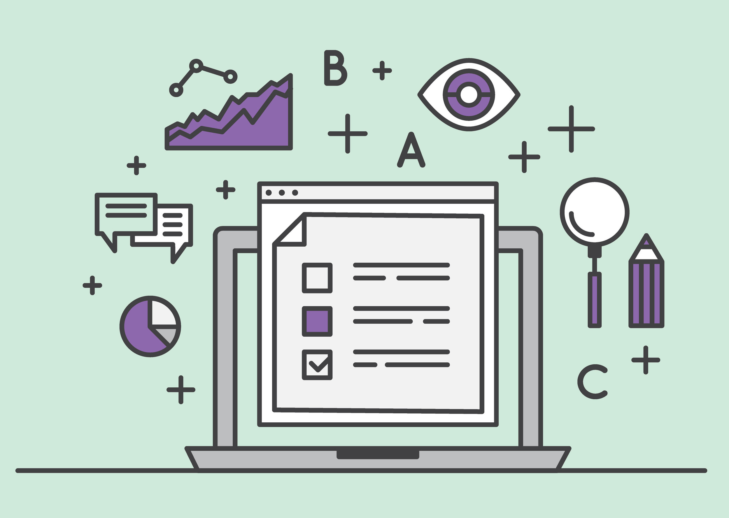
Usability testing doesn’t have to be complicated or costly.
Got two friends with two minutes to try out your project? You’ve done a usability test. It’s better to test even one person’s experience than not to test at all.
I have experience with all aspects of usability testing.
I have worked with a team to conduct formal, in-person usability tests for the Extension website. User personas were created, survey questions were developed, and user tasks were written. The team recorded each test response and reported results based on the most to least pressing issues.
The final usability report included all aspects of the testing process (both mobile and desktop) and inspired changes that improved the usability and efficacy of the site, including:
Making the navigation bar more accessible by darkening the red
Adding clear call-to-action buttons
Reducing the amount of text and adding relevant cross-links to other pages
Rearranging the dropdown and side navigation to pull popular content to the forefront
Removing the main page slider (not accessible) and adding icons for calls to action
Below are the results of our usability test site changes for the www.uaex.uada.edu website. Note: an archived live page of the site could not be found, so the artist’s mockup was used for reference.

BEFORE: The red navigation was not accessible, social media icons were missing, the site search was easily overlooked, and there was too much intro text. Users didn’t know where to click or what to do without clear call to action buttons.

AFTER: The red navigation bar was darkened, social media links were added to the top, the share toolbar was removed, the search bar was given more prominence, the image slider was replaced with static images, and call to action icons were added.
“If you want a great site, you’ve got to test. After you’ve worked on a site for even a few weeks, you can’t see it freshly any more. You know too much. The only way to find out if it really works is to test it.”